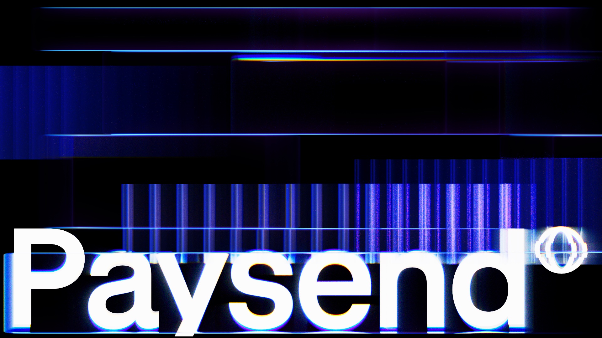
a rebrand that made paysend° look like what it does.

c-level interviews and category research led to one insight — speak as the infrastructure behind global payments.
insight became platform, platform became identity — then months of massive production, two teams as one.
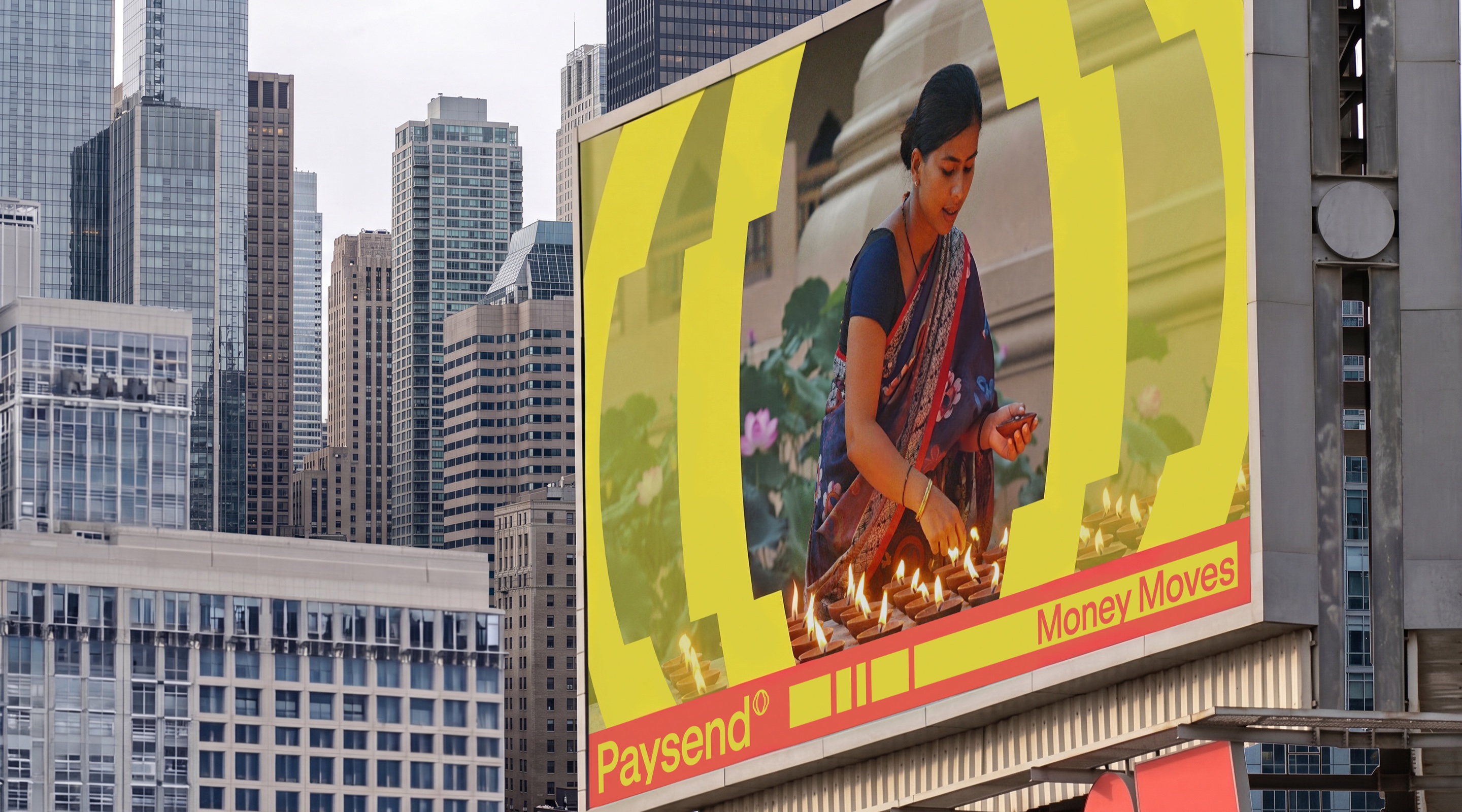






colour
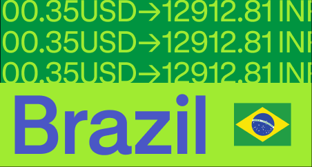
a global approach — five audiences, one brand. the palette splits by product: recognisable everywhere, tuned to each segment.

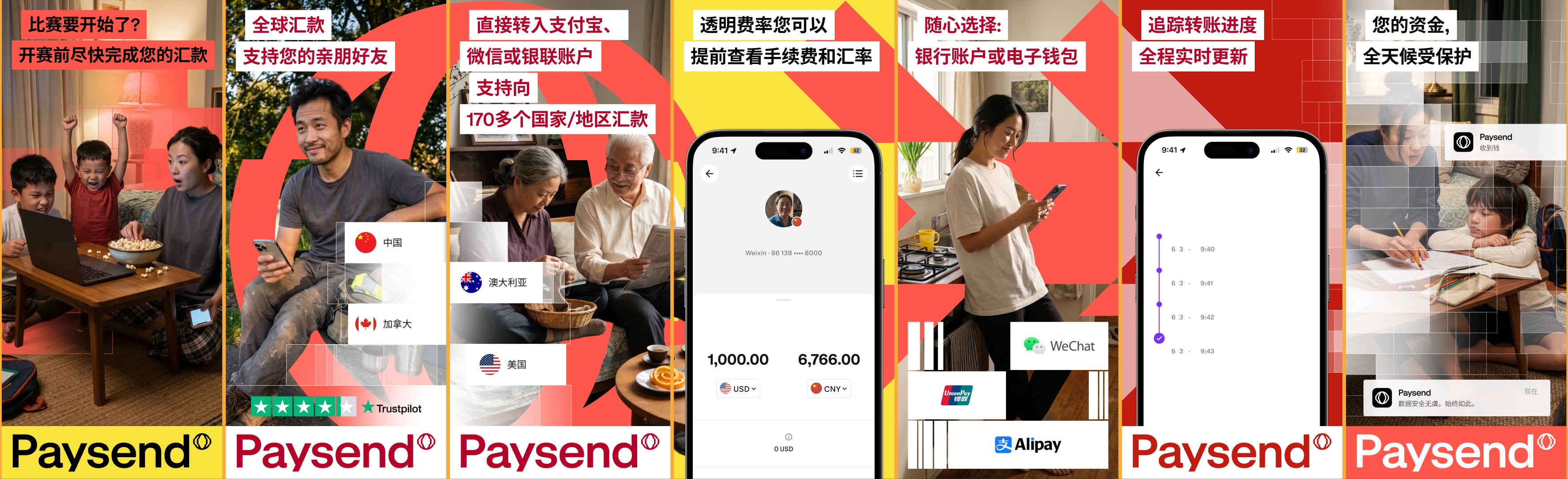

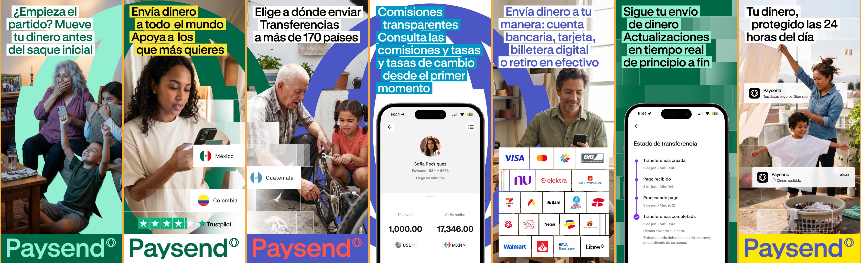

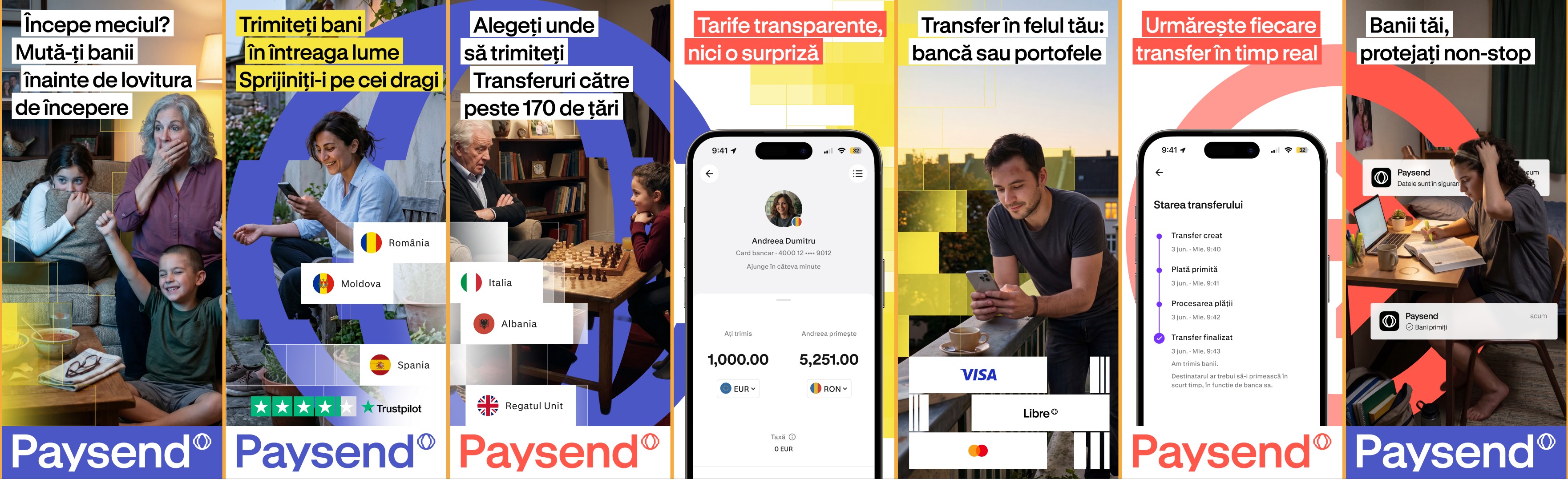
logo
three strokes, one mark — paysend° at every level: tech company, payments infrastructure, end-customer products.


graphics
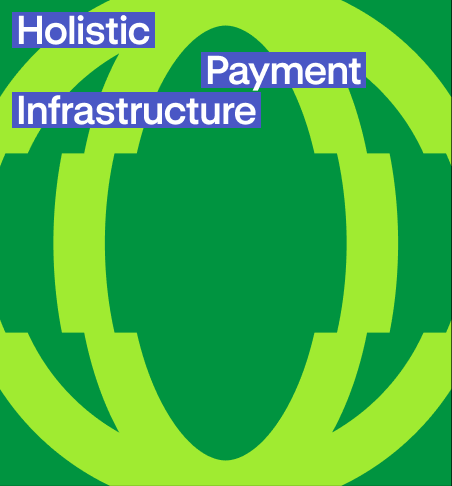
every image expresses system, technology, or motion forward.





website
the same system, atomic — under llm control. pages assemble from existing blocks; automations keep the site current in 12 languages.

credits
built by two teams, as one — paysend° & unknw, end to end.
thank you for the trust — it was a privilege to build this together. and thanks to the whole paysend team.
ivan chekalov — senior director, design & brand
olia altukhova — brand design lead
lisa severova · mike rosenblatt
 design team
last updated 31 july 2026